 A while back I reported on my design of a book cover for my good friend Hart Johnson. Since then this project has evolved from a single book into a work that is to be serially released. I gather the positive feedback to my cover design is at least partially responsible for the move to release this series privately — without skimping on quality, though, as Hart believes in the necessity of professional editing.
As a serial work this project is going to need several new covers to fit the new brief, about a dozen in total. We have decided to keep with the apocalyptic theme of the original and feature a new image for each of the episodes. Over the past week or so I have been working hard on the first two parts, titled Ill Omens and In Short Supply. Each new part has a different coloured background and featured image, but keeps a common titling and layout.
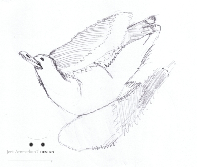
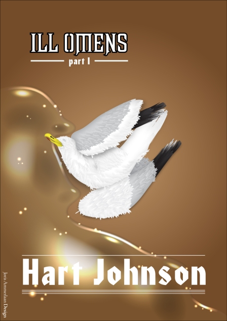
For the first book, Ill Omens, we featured the first sign of the troubles ahead: dead birds drifting up on shore. The first sketch of this scene captured the desired pose at the first attempt and I could immediately move forward to digitizing the scene, scanning the image into the computer at high resolution so I could trace it into my graphics program.
Unlike the previous cover, which I did in CorelDraw on a Windows machine, I am designing these on a Mac in Adobe Illustrator CS4. My 1tb hard disc on the other machine died over a year ago, taking virtually everything with it; I backed up the most important things, of course, but the vector files of this cover was amongst those things lost. The data should be retrievable, but until I can scrounge together the funds to have them operate on my disc, it will have to wait… So Adobe Illustrator it is, this time around, and that is of course no bad place to be!
For the cover of Ill Omens I traced the different body parts of the bird by hand and coloured them with simple flat colours (white, black, and several shades of grey). I then duplicated these parts in white and used an “inner glow” filter on them, outlining the inside with a dark gradated outline. Then setting the opacity to Multiply I could add shading to the body parts and every other layer I sandwiched between these and the shading.
To detail the body I drew a simple feather shape that I filled with a white to grey gradient (or grey to darker grey, or grey to black, you get the point). By putting these feathers in strategic places in different sizes I could build up an appropriate feathery scruffiness to the body. For the final detailing I drew on some shadows, especially around the neck to which I applied a Feather filter to blend them into the drawing. I also applied a simple Drop Shadow filter to the other body parts with the correct density and position to sell the idea of depth in this dead bird.
For the final touch I wanted a watery background to the scene, helping to set it on a beach. For this I first made a water shape with a very light blue fill, set to Multiply to cover the brown background. I then started adding shading and highlights. The first detail was to take an outline of just the water’s edge and apply a tapering stroke to that. Then outlining the stroke, adding a black fill and applying a Feather filter gave me a shadow of the water’s slightly convex edge. This shadow was moved under the water layer in the layer stack. I then took the same outline of the water’s edge but took out the nodes that would not be highlighted (leaving only the parts of the outline on the top and the left of the curves). These separate outlines then also had tapered strokes applied to them, the strokes outlined and a Feather filter applied to them. However, I filled them with a white to black radial gradient, which, with the opacity set to multiply, gave nice, sunset-y honey-coloured highlights.
The next step was to add some shape to the curves themselves, putting simple ovals into the top corners of the curves to give them some depth (with the same style as the edge highlights), and darker ovals under the water darker with a low opacity and a Feather filter to add shadow under the water and add more texture. This was then complemented with larger shadowed areas under the main body of the water, with sharper edges to give the appearance of slight waves casting them, and larger highlighted areas helping to give it some more shape. The final step was to add a spray of small oval highlights scattered over the whole body of water to complete the illusion.
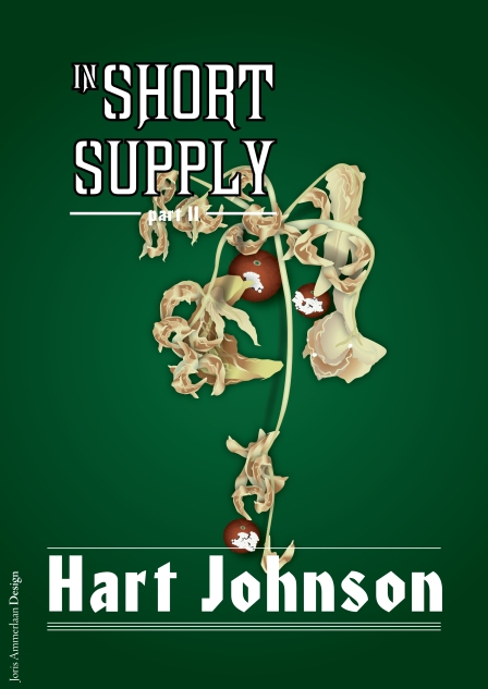
 For the second cover, which I’ve agreed to first show today, Hart and I decided to feature a dead tomato plant on a green background – a choice of background colour, incidentally that we came up with independently of each other. As I wanted to keep with the top down perspectives of the first two covers I looked online for photos of dead tomato plants from this perspective (weird images such as these are yet another thing the digital age has made much easier to come by). Unfortunately I only managed to come up with one such photo. Using this as my guide I started drawing my plant – and quickly found out just how annoying it is to draw dead, curled up leaves. The only way to achieve the desired look was to draw each curled up section of the leaf individually and shade it using a customized gradient, plus then adding some Drop Shadow filters to match, and finally adding some gradiated curly edges to finish the look. As you can imagine, doing this for a dead but still fully-leafed plant was a lot of work, and I had to start over a couple of times before I got any useful leaves.
However, about halfway through I came up with sickle-shaped leaf that I could duplicate in a particular triad and then use to flesh out most of the plant without it becoming too obvious – especially with the titling obscuring a good portion of it. The final and most important step was to come up with a nice rotten tomato. I did this by detailing a red oval shape with several smaller oval shapes gradiated from dark red at the top to the same red as the background shape nearer the bottom, giving a star-shaped series of shadows at the top culminating in a brown to green gradiated little oval at the top. This basic form was then shaded by duplicating the base object and filling that with a gradient that is dark red at the edges to red in the centre, stacked under the ‘stem’ object in the layer stack with an opacity set to Multiply. I then added wrinkles to the individual segments of the fruit using a cracked-concrete texture/shape I had extracted from one of my own photos for an earlier project. These wrinkles where a very dark red in colour and where duplicated for each of the five segments plus one for the base shape, each one slightly rotated from the others and masked out to fit the segments using a clipping path formed from the segment ellipses. I then decided to give the base shape an irregular outline by applying a Roughen filter to it, making sure to transfer this new shape to the shading object and the clipping path. I then covered the tomato in patches of mold, making these out of a series of simple ovals in different sizes with a gradient fill. This gradient consists of a white base colour shifting to a sickly green at the very edges, with this same edge set to 0% opacity so it blends smoothly into its neighbours, with a small dot of the same green in the centre to simulate spores. These white shapes are backed with the same shapes at a slightly larges scale with black instead of white. These tomatoes were then duplicated and the fungi rearranged to simulate different fruits.
Finally the titling was added to the cover for this second part of the series. The first book of this series, Ill Omens, should be out in September of this year.


Once again, your conceptual grasp is spot on! It seems that you take a concept and bring it life on the page. It’s amazingly deceptive…it appears almost easy in your hands. Can’t wait to see your next work.